 NB Lifetime Member
Infographics Pack
$6.29


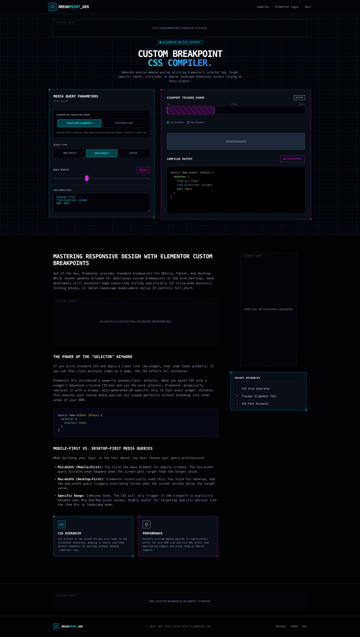
In a digital landscape populated by an infinite variety of device resolutions, standard breakpoints often fall short. BREAKPOINT_GEN is a high-performance utility designed for developers and power users who need to solve edge-case styling challenges with surgical precision. This tool eliminates the “bloat” of traditional responsive plugins by allowing you to compile custom CSS media queries that target exact pixel values, ensuring your layouts remain flawless from the smallest folding phone to the widest cinema display.
The interface is built around a logical, two-pane workspace that prioritizes workflow speed and technical accuracy:
Advanced Targeting Modes: Toggle between Selector (Elementor) and Custom Class modes. The compiler is specifically optimized for the “selector” keyword, ensuring your CSS is scoped perfectly to individual widgets without bleeding into other areas of your DOM.
Architecture Selection: Choose your query logic with a single click. Whether you prefer a Mobile-First (Min-Width) approach, a Desktop-First (Max-Width) strategy, or a Specific Range for unique device orientations, the tool adapts its output to match your development philosophy.
Visual Viewport Mapping: The integrated Viewport Trigger Range visualization provides a clear, color-coded bar representing exactly where your CSS logic will activate. This visual feedback loop prevents common “overlapping logic” errors in complex stylesheets.
BREAKPOINT_GEN doesn’t just generate code; it writes professional, optimized CSS. The Compiled Output window provides a real-time preview of your media query, formatted for immediate use.
Clean Syntax: The compiler outputs minified yet readable code, including proper nesting for CSS directives like display, flex-direction, and gap.
One-Touch Portability: Use the “Copy Script” button to move your custom logic directly into your project’s Advanced CSS tab or external stylesheet, drastically reducing the time spent on manual typing and syntax debugging.
By utilizing manually written media queries through BREAKPOINT_GEN, you significantly improve your site’s Core Web Vitals. Unlike “Hide on Mobile” toggles that duplicate DOM elements and increase page weight, this compiler allows you to override styles through the CSS hierarchy. This results in a leaner DOM, faster execution times, and a more sustainable approach to responsive web design.
While built for general CSS flexibility, BREAKPOINT_GEN features native support for Elementor’s unique pseudo-class selectors. It empowers you to go beyond the default Mobile/Tablet/Desktop icons, giving you the freedom to target ultra-wide monitors or landscape tablet modes where native UI controls often fail.
Stop compromising on your responsive vision. We invite you to click the “Live Preview” button to interact with the compiler and experience the power of precision-targeted CSS before your next deployment.
NB Lifetime Member
 Sale!
AI Prompts
Sale!
AI Prompts
 Sale!
NB Lifetime Member
Sale!
NB Lifetime Member
 Sale!
eCommerce
Sale!
eCommerce
Get instant support and quick responses!
Reviews
There are no reviews yet.